
"Valley Voice" - The Aro Valley Community Newsletter

About the Design
In April 2025 I had the opportunity to work alongside Editor Brent Efford on the Te Aro community newsletter to refresh and update the design.
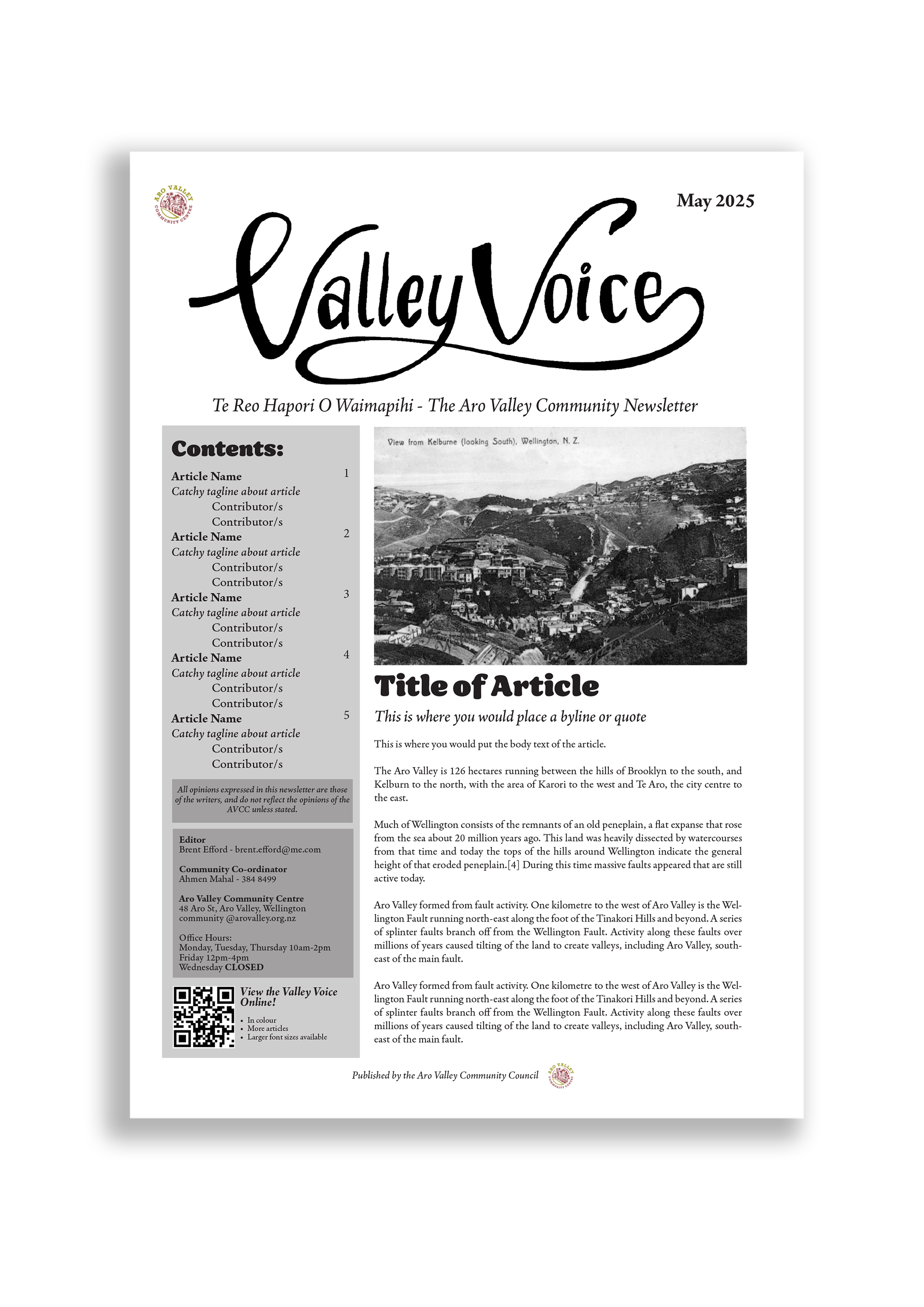
I began by brainstorming ideas for the new header. Brent and I were keen to preserve the historical and old fashioned look of the newsletter to keep it cohesive with previous publications, so I decided to create some variations of the Valley Voice in hand drawn cursive fonts. The limited budget for the local newsletter meant the printed version had to be produced in black and white, while the online version is in colour. This was a unique challenge I was excited to tackle. In the end, I made the decision to go with a single accent colour which would be effective in both versions.
In addition to the logo and layout, I provided Brent with a few design tips and tricks to use for the inside of the Valley Voice going forward relating to font choice, spacing and margins. I'm thrilled to have worked with such an awesome publication, and look forward to seeing future copies around Te Whanganui a Tara!
Additional Design Drafts:


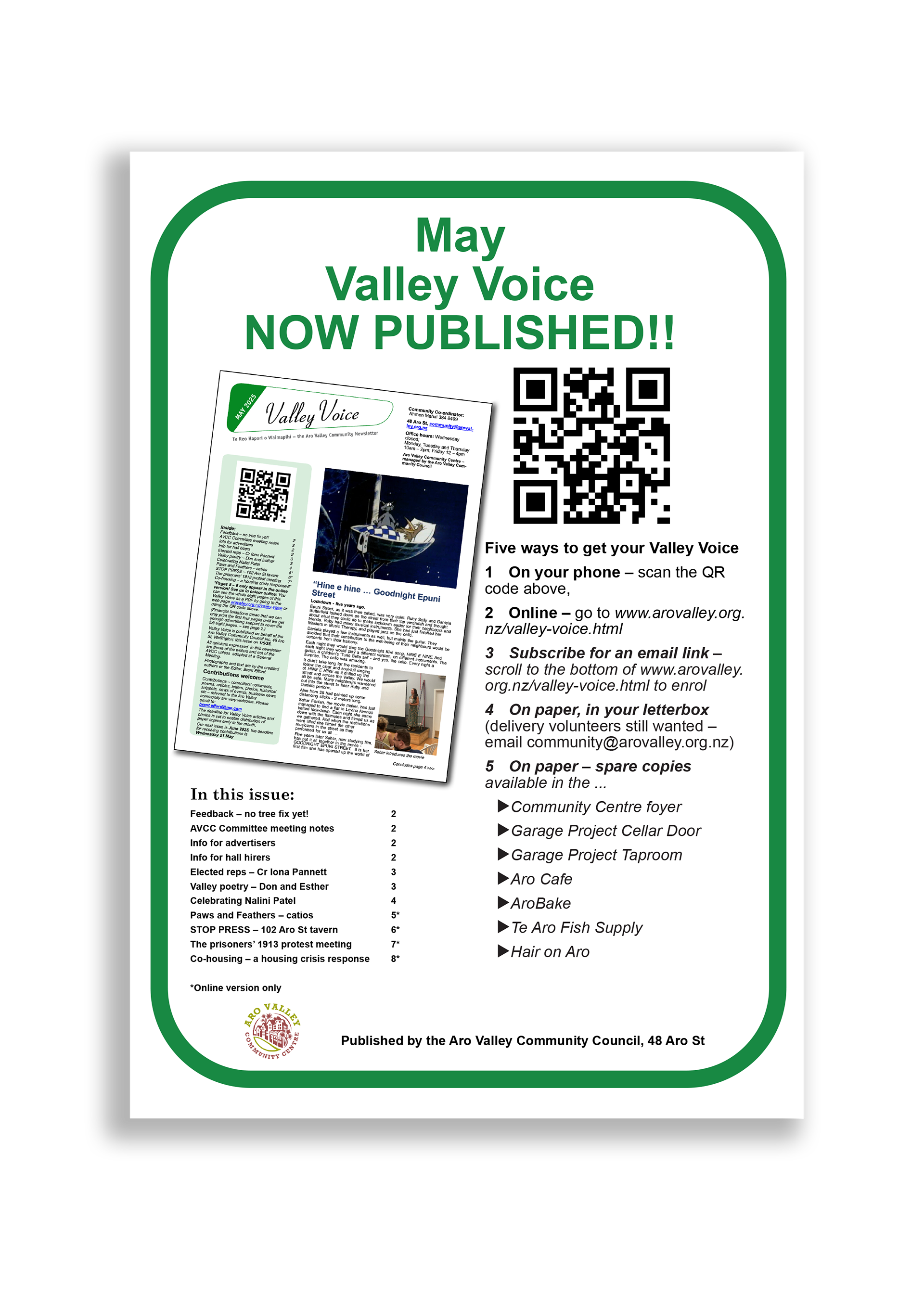
Old Layout (Below)

Alongside the logo redesign, I provided the Brent with a reusable template for the newsletter which would establish consistent margins, columns, and font choices, which would make the publication easier to read and more accessible for the community.